A Brief History of the Internet
How did we get here?
Let’s be honest: technology can be exhausting sometimes.
It seems that each passing year (or perhaps more accurately, each passing day) brings with it a dozen new technologies, from new social media platforms to connected smart home devices to drone-delivery-in-seventeen-minutes-as-a-service.
The Internet of Things is booming. But before the Internet of Things came along, it was simply…The Internet.
So how did it all get started? And why does it matter for you, the business owner who occupies a relatively small corner of the Internet?
1989: The Internet (as we know it) is born
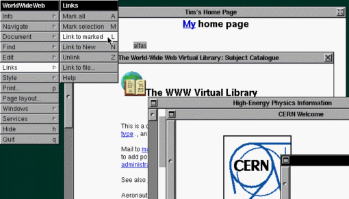
Although Al Gore would have you believe otherwise, the Internet was actually invented in 1989 by a British guy named Tim Berners Lee. While working at CERN, the European Particle Physics Laboratory, Lee wrote the first web client and server.

Ever notice the http:// in front of a website? He’s the guy responsible for that.
But the web didn’t look anything like it does today in 1989. It was mostly text – green characters on a black screen. The days of photos, interactivity, and websites as we know them today were long off…Lee’s contribution was getting all of those computers to actually talk to each other.
August 6, 1991: The First Web Page

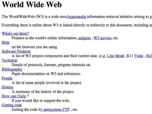
August 6, 1991 was a day that would forever change the course of history: it was on that Tuesday that the first web page was created.
A simple textual description of a new standard called “The World Wide Web,” or W3 for short (aren’t you glad we don’t call it that anymore?).
While it seems small and inconsequential, this was the first time HTML was ever used to create a web page with links and direct computers to other pages. Let the network begin.
Believe it or not, the world’s first web page is still online!
1994: The First Browsers
Now that there were web pages, people needed web browsers.
What we take for granted as pre-installed software on our computers were once a rarity. The first web browsers were clunky, slow, and could only display the most basic content – text and bitmapped images.
Although the first web browsers were much more developed than the green-text-on-a-black-screen that was synonymous with the early days of the Internet, they were a far cry from browsers like Safari and Google Chrome that we’re used to today.
Netscape was the first big browser to come onto the scene and gain widespread adoption, thanks to its use of tables. Tables gave web developers a new way of organizing and displaying content, but they were time-consuming to create and edit. Netscape was co-founded by now-famous venture capitalist Marc Andreessen and was later acquired by AOL.
1994: Flash
In 1994, Macromedia developed a new technology called their Flash Player, which allowed designers and developers to present graphically-oriented, highly animated web pages.
Flash was also used for gaming applications and animated movies, but its origins were to create web pages. Flash was timeline-based, meaning that developers could add complex animations, interactions, and logic to their designs.
While this new age of graphical elements and interactivity was appealing to many, Flash required lots of processing power, it wasn’t very search-friendly, and uploading new content was difficult and time-consuming.
1998: CSS
While the origins of the Internet were focused on content, CSS brought the style. CSS (short for Cascading Style Sheets) allowed designers and developers to style their websites easily, separating content from presentation.
With only HTML at their disposal, developers would have to re-code every instance of an element on their website (say, a button) if they wanted to change the look and feel of that element. With CSS, multiple instances of an element could reference the same style in a few lines of code. Doing so made code easier to read and change, and helped with webpage load times and server resources.
Want to change the style of every single button on your website? Yo no longer have to search for every button, changing its code to reflect your stylistic changes – just change a few lines of CSS and they’ll all conform automatically.
2007: The iPhone
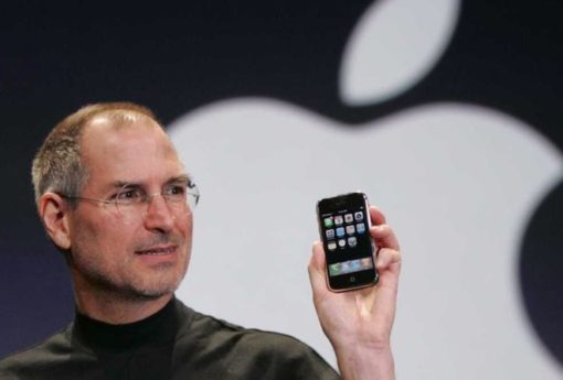
Apple introduced the iPhone on June 29, 2007, forever changing the landscape of the mobile web. Unlike any other device before it, the iPhone truly put the Internet in your pocket, beginning the rise of mobile web browsing.
While most websites weren’t anything special on mobile devices back then, the iPhone would help the mobile web out of its infancy and into the limelight.
Another major paradigm shift that the iPhone brought about? Apple refused to let the iPhone adopt Flash. While this was done for security concerns (Flash wasn’t very stable or secure), it had profound implications for how the mobile web would develop.
If you went to a Flash-based website on the iPhone, you’d see a blank screen. While Flash was a very popular web design tool back then, the iPhone’s popularity created a shift in the mobile web, forcing technologies to change and adapt to its rise…and we’re better off for it.
2010: Responsive Web Design
One of the changes the iPhone brought about was responsive design. A phrase coined by Ethan Marcotte in 2010, responsive design is a design philosophy that allows content to change based upon the size of the screen it’s being viewed on.
On a desktop, you can expect to see wide photos and elements next to each other; on an iPad or iPhone, elements are more likely to “stack” on top of each other, given the narrower screen size.
Think of content in responsive design like water – it will adapt to fill the space it occupies. The content itself doesn’t change…it just changes how it’s presented.
Responsive design doesn’t mean a separate mobile website that you have to update separately (no more mobile.yoursite.com) – just one website with content that adapts to its viewport.
2011: Flat Design
A more recent trend in the history of the Internet is that of flat design. Think bright, bold, solid colors, incredibly subtle gradients (when there were any at all), and a focus on geometric shapes.
While many websites and operating systems (think of the iPhone before iOS 7) used to be skeuomorphic (meaning that items represented resemble their real-world counterparts), flat design burst onto the scene and chose to focus on colors, content, and abstraction.
While some thought flat design was a fad that would be gone soon, it has stuck around; we’re still seeing many elements of flat design in the best websites and apps today.
The Future
So where does that leave us? And where are we going next?
There are new technologies like virtual reality and artificial intelligence that could deeply impact the way we interact with the Internet as we know it today. It’s too early to tell how these technologies will change the Internet (or which will be the first to make it into the homes of people across the world).
However, as Internet technologies are evolving, there’s no doubt that the future of the Internet will be mobile-first. Desktop browsing isn’t going away, but as our world becomes more interconnected and on-the-go, richer mobile experiences will become an increasingly valuable asset.
We’ll see more interactivity, websites that work more consistently across browsers, platforms, and devices, and we’ll discover new ways of experiencing content on a number of devices.
Without a doubt, it’s an exciting time to be online.
Credits: Animated GIFs from the FROONT Blog


